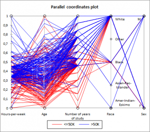
Parallel coordinates plots
Parallel coordinates plots can be used to characterize groups of observations using real variables. Do it in Excel with the XLSTAT statistical software.

What is Parallel Coordinates Visualization
This visualization method is useful for data analysis when you need to describe groups using variables. For example, this method could be used on groups generated by Agglomerative Hierarchical Clustering.
Using this method you are able to visually determine which variables are discriminative.
Structure of a Parallel Coordinates plot
If you consider N observations described by P quantitative and Q qualitative variables, the chart consists of P+Q vertical axes each representing a variable, and N lines corresponding to each observation. A line crosses an axis at the value corresponding to the value that the observation takes for the variable corresponding to the axis.

