Multiple Correspondence Analysis (MCA)
Multiple correspondence analysis lets you explore wide datasets of qualitative variables. Do it in Excel with the XLSTAT add-on statistical software.

What is Multiple Correspondence Analysis
Multiple Correspondence Analysis (MCA) is a method that allows studying the association between two or more qualitative variables.
MCA is to qualitative variables what Principal Component Analysis is to quantitative variables. One can obtain maps where it is possible to visually observe the distances between the categories of the qualitative variables and between the observations.
Multiple Correspondence Analysis (MCA) can also be understood as a generalization of Correspondence Analysis (CA) to the case where there are more than two variables.
How does Multiple Correspondence Analysis work
A series of transformations allows the computing of the coordinates of the categories of the qualitative variables, as well as the coordinates of the observations in a representation space that is optimal for a criterion based on inertia. In the case of MCA one can show that the total inertia is equal to the average number of categories minus one. XLSTAT also computes MCA by using the Burt table instead of the disjunctive table. As a matter of fact, the inertia does not only depend on the degree of association between the categories but is seriously inflated. Greenacre (1993) suggested an adjusted version of inertia, inspired from Joint Correspondence Analysis (JCA). This adjustment allows us to have higher and more meaningful percentages for the maps.
Advanced Multiple Correspondence Analysis
The analysis of a subset of categories is a method that has very recently been developed by Greenacre and Pardo (2006). It allows us to concentrate the analysis on some categories only, while still taking into account all the available information in the input table. XLSTAT allows you to select the categories that belong to the subset.
Multiple Correspondence Analysis output in XLSTAT
- Disjunctive table: This table is displayed only if the input data correspond to an observations/variables table. This table is an intermediary table that allows us to obtain the contingency table that corresponds to the two selected variables.
- Burt table: The Burt table is displayed only if the corresponding option is activated in the dialog box. The 3D bar chart that follows is the graphical visualization of this table.
- Eigenvalues and percentages of inertia: The eigenvalues, the percentages of inertia, the percentages of adjusted inertia and the corresponding scree plot are displayed. Only the non-trivial eigenvalues are displayed. If a filtering has been requested in the dialog box, it is not applied to this table, but only to the results that follow.
- Principal coordinates: This table displays the principal coordinates which are used later to represent projections of profile points in symmetric and asymmetric plots.
- Standard coordinates: This table displays the standard coordinates which are used later to represent projections of unit profile points in asymmetric plots.
- Contributions: The contributions are helpful for interpreting the plots. The categories that have influenced the most the calculation of the axes are those that have the higher contributions. A shortcut consists of restricting the analysis to the categories which contribution on a given axis is higher than the corresponding relative weight that is displayed in the first column.
- Squared cosines: As with other data analysis methods, the analysis of the squared cosines allows us to avoid misinterpretations of the plots that are due to projection effects. If, for a given category, the cosines are low on the axes of interest, then any interpretation of the position of the category is hazardous.
Multiple Correspondence Analysis charts in XLSTAT
The plots (or maps) are the ultimate goal of Multiple Correspondence Analysis, because they considerably facilitate our interpretation of the data.
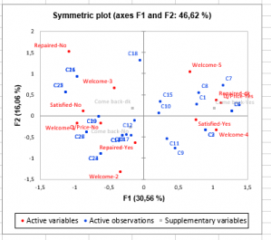
- Symmetric plots: These plots are exclusively based on the principal coordinates. Depending on the choices made in the dialog box, a symmetric plot mixing observations and variables, a plot showing only the categories of the variables, and a plot showing only the observations, are displayed. The percentage of adjusted inertia that corresponds to each axis and the percentage of adjusted inertia cumulated over the two axes are displayed on the map.
- Asymmetric plots: These plots use the principal coordinates for the categories of the variables and the standard coordinates for the observations and vice versa. The percentage of adjusted inertia that corresponds to each axis and the percentage of adjusted inertia cumulated over the two axes are displayed on the map. On an "asymmetric observations plot", on can study the way the observations are positioned relatively to the category vectors. The later indicate directions: if two observations are displayed in the same direction as a category vector, the observation that is the furthest in the category vector direction is more likely to have selected that category of response.


analyze your data with xlstat
Related features