Youden Plots
Use this tool to create a Youden plot after collecting measurements to compare two materials A and B each evaluated by a series of laboratories.

What is a Youden plot?
Youden (1959) developed a procedure for representing data produced by N laboratories for two similar materials A and B (they can be identical when we want to compare measurement methods, or different but expected to give identical values). The objective here is to simply identify which laboratories are problematic, either because the two measurements performed show an abnormal difference, or because the two measurements are too different from what is obtained by other laboratories. Both inter-laboratory variability and intra-laboratory variability are analyzed here.
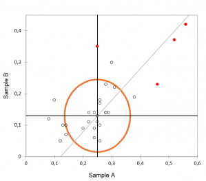
The result is a chart showing the measurements for material A on the abscissa axis and for material B on the ordinate axis. A circle, in the version described by Youden, is then displayed in order to be able to identify suspicious values, those which are outside the circle.
Options for the XLSTAT Youden Plots function
Originally, Youden made a prerequisite that the 2 materials tested are fairly close and that the measurements are on identical scales. However, if this is not the case, the XLSTAT user can request that the data be standardized. To standardize the two samples, the user has the option of choosing between a classic standardization (based on the arithmetic mean and unbiased variance), or a standardization based on robust statistics, as described in ISO 13528-2015-10 (algorithm A). Alternatively, the XLSTAT user can choose one of the two display methods which make it possible to get rid of data standardization.
XLSTAT therefore offers three types of representation:
Circle: Youden's procedure is directly applied.
Ellipse: XLSTAT displays an ellipse around the observations. If the choice of robust statistics has been made, the robust covariance is used for the calculation of the ellipse (Maronna, 2019). The calculation of the ellipse can be done using a confidence interval based on either Fisher or the Chi-square distribution.
Boxes: XLSTAT will display rectangles which on each axis surround the average by an interval of 2x2 and/or 2x3 times the measured standard deviation.
Results for the XLSTAT Youden Plots function
Summary statistics: In this first table you can find the basic descriptive statistics for each method.
Data and differences: In this table are displayed the data (standardized if the corresponding option has been activated) of samples A and B, as well as the differences and the absolute centered differences (the difference of the means is removed from the observed difference). The average of |D| is used for the calculation of Youden's circle.
Robust statistics: When requested, the robust statistics are displayed in this table.
Youden plot: This graph displays the data (standardized if the corresponding option has been activated). If the data is not standardized, a vertical line and a horizontal line passing through the means point are displayed. The straight line passing through the estimated means of the two samples (the origin if the data is standardized) and having an angle of 45° (circle option) or corresponding to the principal axis of the ellipse (ellipse option) is displayed. In case the boxes have been requested these are displayed on the graph.


analyze your data with xlstat
Included in