New version for Statistical Process Control (SPC)
A new version of our Statistical Process Control (SPC) tools is now available.
This version offers new functionalities for quality control agents and other industrial specialists who carry out Statistical Process Controls.
Statistical Process Control tools are available in XLSTAT Quality and XLSTAT Premium solutions.
What’s new ?
- With this new version, you get a more ergonomic interface and a better performance in the analyses executed from the Statistical Process Control menu. Important fixes have also been made (crashes, error messages).
- In the Gage R&R functionalities, a Missing Data tab has been added to manage your missing values.
- In addition, it is now possible to select your variables from a drop-down list or to call a dataset from a txt/csv file. A video on how to select data with XLSTAT is available.
What is Gage R&R for quantitative variables?
This XLSTAT tool enables you to know if the variability of the measures of our products comes from mistakes made by the operators or from a real production problem. It lets you evaluate repeatability and reproducibility.
Let’s look at an example
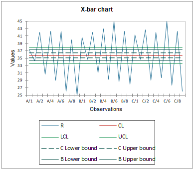
Three operators have to measure 10 parts three times. The goal is to see what is causing the differences in the measurements of the parts, and whether the operators need more training in order to get more precise measurements.
Among the charts displayed by XLSTAT, you can find the X Bar chart , which represents the average measurements for each sample by each operator, as well as the control limits so you can see whether production is under control or if the differences between measurements are too high.
Available in the Statistical Process Control menu (SPC).
What is Gage R&R for qualitative variables (attributes)?
This XLSTAT tool enables you to evaluate how reliable the evaluations of judges or operators are on a qualitative scale. Like the Gage R&R for quantitative variables, it enables you to evaluate the reproducibility and repeatability of the judges. It can be used in the field of cosmetics to evaluate the effects of a new product, for example.
Let’s have a look at an example
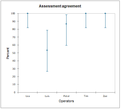
Five operators have evaluated the skin condition of 15 patients by classifying it into five categories : Very bad, Bad, Medium, Good, Excellent. Each operator has evaluated each patient twice. The goal was to compare their opinions to biological markers as well as to evaluate whether they remained consistent from a session to another.
Among the charts displayed by XLSTAT, we can see the confidence intervals regarding the assessment agreement, which represents the percentage of identical answers in both sessions for each operator.
Available in the Statistical Process Control menu (SPC).
What are control charts in XLSTAT?
Control charts are used to graphically display the control limits for your production or product evaluations. If your observations go outside the control limits, it means that your production or judgment is not under control.
Several types of control charts can be used depending on the situation. You can use:
- individual control charts
- subgroup control charts
- attribute control charts
- time-weighted control charts
Let’s have a look at a few examples
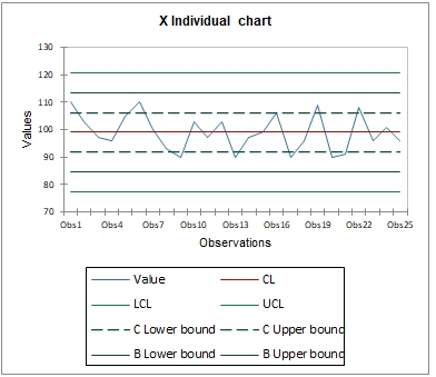
Do you want to control the variability of your measurements? Choose the individual control chart!
A part has been measured 25 times. Here, we can see the different values obtained by the measurement in comparison to the control limits.
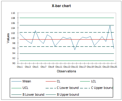
Do you have several groups of measurements? Choose the subgroup control chart!
Here, we are in the same situation as above, except that we have been taking 5 measurements per session instead of one. Each measurement represents a subgroup. The X bar control chart enables us to control their average.
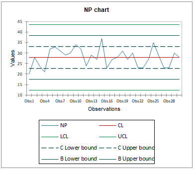
You want to control the amount of damaged products or negative reviews? Choose the attribute control chart.
Here, for example, the number of damaged peaches has been counted in 30 crates of 1000 peaches each. The NP chart below represents the amount of damaged peaches in each crate in comparison to the control limits.
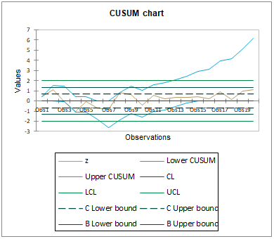
You have data for which changes have to be monitored depending on time? Choose time-weighted control charts.
The CUSUM chart below represents the standardized observations of 4 measurements taken 20 times. Then, it shows the cumulative sums of the averages of these values in order to see if they stay between the control limits or if there are significant mean shifts in the measurements.
All of these charts are available in the Statistical Process Control (SPC) menu.
How to get this new XLSTAT version?
This version give you access to all the above improvements, advanced options and increase the performance of your software. Installing our new version is recommended for all users.
If you are currently using our trial version or have a valid license, you can download this version for free at:
Últimos tweets
No Tweet