Truncated bar charts
Use this tool to create bar charts where part of the scale is squeezed.

This visualization tool allows to display properly values that are spread on two extremes of the same scale, without having to use a log scale or other transfrormation. Although it is very convenient, it is very cumbersome to break a chart axis in Excel. Furthermore, XLSTAT allows to use transparency to partly show the information that is hidden in the removed or squeezed part of the scale.
This tool can work directly on quantitative data (typically frequencies), or on raw qualitative data (weighted or not) that are transformed into a frequencies table before the bar chart is displayed.
Options for Truncated Bar Charts in XLSTAT
This feature offers several options to set up the dialog box.
Data format:
Quantitative: Activate this option if your data correspond to a simple list of numerical values, a contingency table or a crosstab. If the "Labels included" option is activated, you must select both the header (column) and the category (row) labels together with the data.
Qualitative: Activate this option if your data are available as qualitative variables that need to be transformed to frequencies before the chart is created.
Quantitative data: If the data format is "quantitative", select the data that correspond to the quantitative data that must be displayed on the bar chart.
- One chart: Activate this option if you want the results corresponding to each column of quantitative data to be displayed on a single chart.
Qualitative data: If the data format is "qualitative", select the data that correspond to the qualitative data that will be used to construct a frequency table, that will then be displayed on the bar chart.
- Sort the categories alphabetically: Activate this option to sort alphabetically the categories of the qualitative variables. If this option is unchecked, the order of appearance is respected.
Subsamples: Check this option to select a column showing the names or indexes of the sub-samples for each of the observations.
Sort the categories alphabetically: Activate this option to sort alphabetically the categories of the subsample data. If this option is unchecked, the order of appearance is respected.
Variable-Category labels: Activate this option to use variable-category labels when displaying outputs. Variable-Category labels include the variable name as a prefix and the category name as a suffix.
One chart: Activate this option if you want the results corresponding to each sub-sample to be displayed on a single chart.
Weights: Check this option if the observations are weighted. If you do not check this option, the weights will be considered as 1. Weights must be greater than or equal to 0. If a column header has been selected, check that the "Variable labels" option is activated.
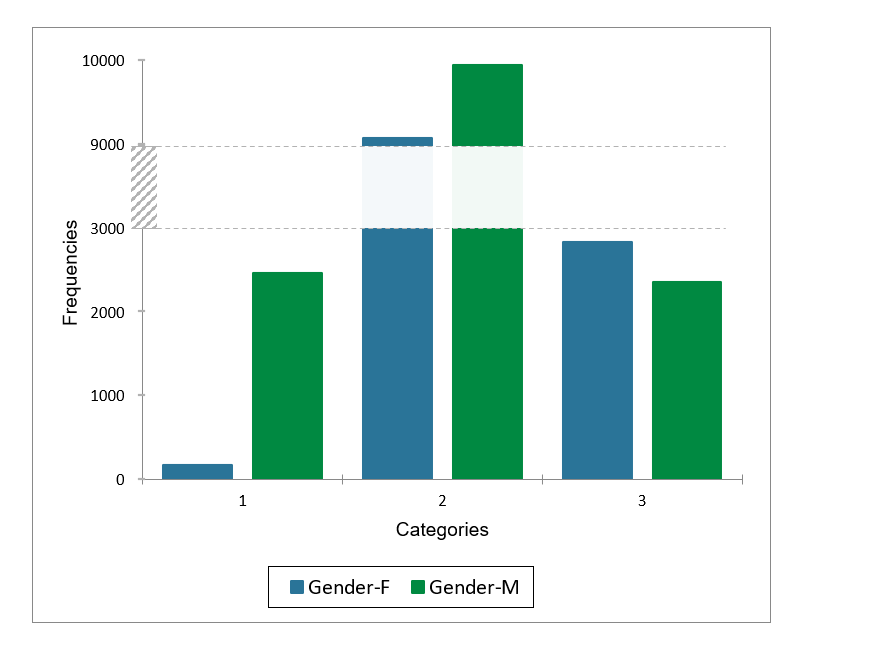
Truncate: Check this option to squeeze the vertical axis of the chart (or horizontal axis if the horizontal option is selected). Select the start and end points on the scale that you want to squeeze or hide.
Transparency(%): Set the transparency of the squeezed part of the chart. Set 0 to completely hide it, or 100 to make it fully visible.
Results for Truncated Bar Charts in XLSTAT
XLSTAT displays descriptive statistics for the selected variables as well as the broken (truncated) bar chart.
Tutorial for Truncated Bar Charts in XLSTAT
An example which explains how to generate and interpret a truncated bar chart in Excel using the statistical software XLSTAT is available on our Help Center.

