Radar charts
Use radar charts to visualize and compare three or more quantitative variables. Available in Excel with the XLSTAT software.

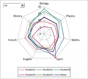
Radar charts (or radar plots) are useful for visualizing and comparing three or more quantitative variables. For example, we can use a radar chart to compare students' grades in each course to the class average.
How to create a radar chart in XLSTAT?
XLSTAT enables you to create and customize radar plots thanks to several options:
Variables or Images: XLSTAT allows you to select variable names in two forms: as text or as images. You simply have to copy and paste images to the Excel cells in the column containing the labels.
Data: You can select one or more columns containing the variable(s) to plot on the radar chart.
Chart type: XLSTAT allows you to customize your radar chart:
- Classic: Enable this option to display a classic radar chart.
- With points: Activate this option to display a radar chart with points.
- Filled: Activate this option to color the different shapes, each shape representing a variable, of the radar chart.
- Polar Graph: Activate this option to display a polar chart.
Group variables: Activate this option to group variables on the same chart.
Labels: Enable this option to display labels on the radar chart.
Axis Values: Enable this option to display the axis values on the chart.
Example
A tutorial on how to use radar charts is available on the XLSTAT Help Center.
Go further
Looking for more basic or advanced visualization tools? XLSTAT proposes a large variety of graphs such as boxplots, scatterplots, histograms, ternary diagrams, probability plots, and more.
Check our tutorials on how to access and use the XLSTAT visualization features.

