Principal Component Analysis (PCA)
Principal Component Analysis (PCA) is one of the most popular data mining statistical methods. Run your PCA in Excel using the XLSTAT statistical software.

What is principal component analysis?
Definition of a Principal Component Analysis
Principal Component Analysis is one of the most frequently used multivariate data analysis methods that lets you investigate multidimensional datasets with quantitative variables. It is widely used in biostatistics, marketing, sociology, and many other fields.
It is a projection method as it projects observations from a p-dimensional space with p variables to a k-dimensional space (where k < p) so as to conserve the maximum amount of information (information is measured here through the total variance of the dataset) from the initial dimensions. PCA dimensions are also called axes or Factors. If the information associated with the first 2 or 3 axes represents a sufficient percentage of the total variability of the scatter plot, the observations could be represented on a 2 or 3-dimensional chart, thus making interpretation much easier.
PCA can thus be considered as a Data Mining method as it allows to easily extract information from large datasets. There are several uses for it, including:
- The study and visualization of the correlations between variables to hopefully be able to limit the number of variables to be measured afterwards;
- Obtaining non-correlated factors which are linear combinations of the initial variables so as to use these factors in modeling methods such as linear regression, logistic regression or discriminant analysis.
- Visualizing observations in a 2- or 3-dimensional space in order to identify uniform or atypical groups of observations.
XLSTAT provides a complete and flexible PCA feature to explore your data directly in Excel. XLSTAT proposes several standard and advanced options that will let you gain a deep insight into your data.
How to configure a Principal Component Analysis in XLSTAT?
PCA on Pearson or Covariance
PCA is used to calculate matrices to project the variables in a new space using a new matrix which shows the degree of similarity between the variables. It is common to use the Pearson correlation coefficient or the covariance as the index of similarity, Pearson correlation and covariance have the advantage of giving positive semi-defined matrices whose properties are used in PCA. However other indexes may be used.
XLSTAT offers several data treatments to be used on the input data prior to Principal Component Analysis computations:
- Pearson, the classic PCA, that automatically standardizes or normalizes the data prior to computations to avoid inflating the impact of variables with high variances on the result.
- Covariance, that works on unstandardized variances and covariances (variables with high variances will play stronger roles in the outputs.
- Spearman, fully equivalent to a classic PCA (based on Pearson correlation) performed on the matrix of ranks.
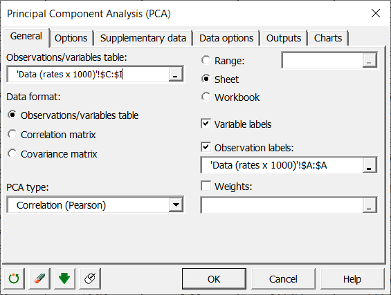
Traditionally, a correlation coefficient rather than the covariance is used as using a correlation coefficient removes the effect of scale: thus a variable which varies between 0 and 1 does not weigh more in the projection than a variable varying between 0 and 1000. However in certain areas, when the variables are supposed to be on an identical scale or we want the variance of the variables to influence factor building, covariance is used.
Where only a similarity matrix is available rather than a table of observations/variables, or where you want to use another similarity index, you can carry out a PCA starting from the similarity matrix (correlation or covariance).
PCA with supplementary variables and observations
XLSTAT lets you add variables (qualitative or quantitative) or observations to the PCA after it has been computed. Those variables or observations are called supplementary. This can be used in several contexts. Here are two examples:
- If the user wants to investigate roughly how a set of dependent variables relates to the others. The set of dependent variables should be used here as a set of supplementary variables and the others (i.e. independent variables) should be used to build the PCA.
- If the user simply wants to see how different categories of observations behave in the PCA space (Males vs Females for example). In this case, a qualitative supplementary variable (sex) may be used to color observations according to the sex they belong to. It is also possible to display the category centroids as well as confidence ellipses around categories.
PCA with rotations: Varimax and others
Rotations can be applied on the factors. Several methods are available including Varimax, Quartimax, Equamax, Parsimax, Quartimin and Oblimin and Promax.
Which are the results of the Principal Component Analysis in XLSTAT?
The XLSTAT PCA feature provides results relative to variables and to observations.
Descriptive statistics: The table of descriptive statistics shows the simple statistics for all the variables selected. This includes the number of observations, the number of missing values, the number of non-missing values, the mean and the standard deviation (unbiased).
Correlation/Covariance matrix: This table shows the data to be used afterwards in the calculations. The type of correlation depends on the option chosen in the "General" tab in the dialog box. For correlations, significant correlations are displayed in bold.
Bartlett's sphericity test: The results of the Bartlett sphericity test are displayed. They are used to confirm or reject the hypothesis according to which the variables do not have significant correlation.
Measure of Sample Adequacy of Kaiser-Meyer-Olkin: This table gives the value of the KMO measure for each individual variable and the overall KMO measure. The KMO measure ranges between 0 and 1. A low value corresponds to the case where it is not possible to extract synthetic factors (or latent variables). In other words, observations do not bring out the model that one could imagine (the sample is "inadequate"). Kaiser (1974) recommends not to accept a factor model if the KMO is less than 0.5. If the KMO is between 0.5 and 0.7 then the quality of the sample is mediocre, it is good for a KMO between 0.7 and 0.8, very good between 0.8 and 0.9 and excellent beyond.
Eigenvalues: The eigenvalues and corresponding chart (scree plot ) are displayed. The number of eigenvalues is equal to the number of non-null eigenvalues.
If the corresponding output options have been activated, XLSTAT afterwards displays the factor loadings in the new space, then the correlations between the initial variables and the components in the new space. The correlations are equal to the factor loadings in a normalized PCA (on the correlation matrix).
If supplementary variables have been selected, the corresponding coordinates and correlations are displayed at the end of the table.
The factor scores in the new space are then displayed. If supplementary data have been selected, these are displayed at the end of the table.
Contributions: This table shows the contributions of the observations in building the principal components.
Squared cosines: This table displays the squared cosines between the observation vectors and the factor axes.
Where a rotation has been requested, the results of the rotation are displayed with the rotation matrix first applied to the factor loadings. This is followed by the modified variability percentages associated with each of the axes involved in the rotation. The coordinates, contributions and cosines of the variables and observations after rotation are displayed in the following tables.
Which charts are displayed for the Principal Component Analysis in XLSTAT?
One of the advantages of Principal Component Analysis is that it provides both an optimal visualization of the variables and data, and biplots mixing the two (see below). However, these representations are only reliable if the sum of the percentages of variability associated with the axes of the representation space is high enough. If this percentage is high (e.g. 80%), one can consider that the representation is reliable. If the percentage is low, it is advisable to make representations on several pairs of axes in order to validate the interpretation made on the first two factorial axes.
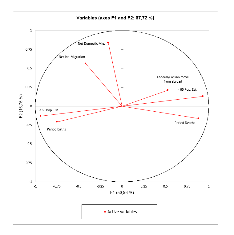
The PCA correlation circle or variables chart
The correlation circle (or variables chart) shows the correlations between the components and the initial variables. Supplementary variables can also be displayed in the shape of vectors.
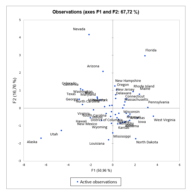
The PCA observations charts
The observations charts represent the observations in the PCA space.
The PCA biplots
The biplots represent the observations and variables simultaneously in the new space. Here as well the supplementary variables can be plotted in the form of vectors. There are different types of biplots:
Correlation biplot: this type of biplot makes it possible to interpret the angles between the variables because they are directly related to the correlations between the variables. The position of two observations projected on a variable vector allows to conclude about their relative level on this same variable. The distance between two observations is an approximation of the Mahalanobis distance in the space of k factors. Finally, the projection of a variable vector in the representation space is an approximation of the standard deviation of the variable (the length of the vector in the space of k factors is equal to the standard deviation of the variable).
Distance biplot: a distance biplot allows to interpret the distances between observations because they are an approximation of their Euclidean distance in the space of p variables. The position of two observations projected on a variable vector allows to conclude about their relative level on this same variable. Finally, the length of a variable vector in the representation space is representative of the level of contribution of the variable to the construction of this space (the length of the vector is the square root of the sum of the contributions).
Symmetric biplot: this biplot proposed by Jobson (1992) is intermediate between the two previous biplots. If neither the angles nor the distances can be interpreted, this representation can be chosen because it is a compromise between the two.
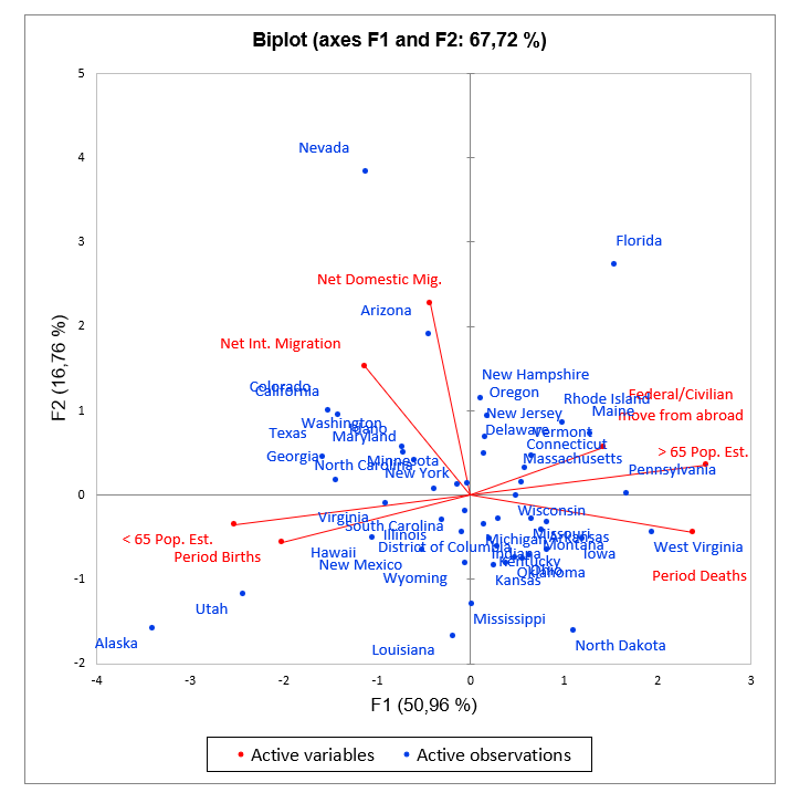
XLSTAT allows to choose the coefficient whose square root is to be multiplied by the coordinates of the variables. This coefficient lets you adjust the position of the variable points in the biplot in order to make it more readable. If set to other than 1, the length of the variable vectors can no longer be interpreted as standard deviation (correlation biplot) or contribution (distance biplot).
Tutorials on how to run PCA in Excel using XLSTAT
Several examples and applications are available on our webiste which will help you set up and interpret a PCA analysis according to your needs.
- An example on how to run a Principal Component Analysis (PCA).
- An example on how to run a Principal Component Analysis (PCA) with supplementary variables and individuals.
- An example on how to customize a Principal Component Analysis (PCA) chart for an easier interpretation.
- An example on how to use Principal Component Analysis and apply filters based on communalities (squared cosines).


analyze your data with xlstat
Related features