Pareto charts
Use this tool to calculate descriptive statistics and display Pareto plots for a set of causes (or qualitative variables). Available in Excel using the XLSTAT software.

This visualization tool, which combines both bars and a line graph, helps you identify the most common causes of a problem (e.g., disruptions in manufacturing assembly, customer complaints) to improve a process. It is often used in Root Cause Analysis. Several new options are available, such as sorting and combining causes, and changing the color of the bars when a certain cumulative percentage is reached.
What is a Pareto chart?
The Pareto chart was named after an Italian economist, but J. M. Juran is considered the first to apply it to industrial problems. It usually consists of a bar chart overlaid by a line chart showing the cumulative total (in %).
It is based on the Pareto principle (also known as the 80/20 rule), which states that 80% of the consequences are due to only 20% of the causes. So, if some defective items are found during quality control, you can perform a Pareto analysis to improve production quality. To do this, you need to list the production defects and the number of defective items with each defect. These numbers are plotted on a bar chart and then converted to percentages in order to show the cumulative percentage on the chart.
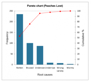
For example, suppose you are checking the quality of a peach crop before sending it to a supermarket for sale. Some peaches might be rotten, bruised, too small, underripe, wormy, or of the wrong variety. All these defects make them non-conforming and unattractive to customers. Using a Pareto chart, you can determine which defects are most common so you can focus on eliminating them. Indeed, according to the Pareto rule, 20% of non-conforming peaches are responsible for 80% of the lack of customer interest.

In the above chart, we see that more than 50% of the defects are due to rotten peaches. Therefore, we must focus on monitoring the ripening so that the peaches do not rot.
Pareto options in XLSTAT
Several sorting options are available to be applied to the causes:
- No sorting: The causes are not sorted.
- Descending: The causes are sorted in descending order by frequency.
- First descending: Causes are sorted in descending order by the first set of frequencies.
- Alphabetical: The causes are sorted in ascending alphabetical order.
You can also group some causes together:
- Frequency less than: Select this option to group categories whose frequency is less than the user-defined value.
- % smaller than: Select this option to combine categories whose % value is smaller than the user-defined value.
- K smallest categories: Select this option to combine the K smallest categories. The K value is defined by the user.
- Cumulative %: Select this option to combine all categories once the cumulative % value of the Pareto plot is greater than the user-defined value.
Pareto chart in XLSTAT
For a sample of N causes, the following descriptive statistics are displayed:
- Frequency: the number N of data in the selected sample.
- Relative frequency (%): the frequency of each of the categories.
- Cumulative %: the cumulative % for each of the categories.
The frequencies or relative frequencies (%) of the different categories of the qualitative variables are displayed as bar charts.
You can configure the options of your chart:
Values used: Select the type of data to be displayed on the left ordinate axis:
- Frequencies: Choose this option to make the scale of the plots correspond to the frequencies of the categories.
- Relative frequencies: Choose this option to make the scale of the plots correspond to the relative frequencies of the categories.
Change color at: Check this option if you want to change the color of the bars when a certain cumulative % is reached.
All series on one chart: If you have selected multiple series of causes or multiple frequencies, enable this option to display all series in a single summary chart.
Tutorial on Pareto Chart
If you want to try out the analysis yourself, please follow our tutorial to learn how to plot a Pareto chart in XLSTAT and how to interpret the results.
Going further on Statistical Process Control
Did you know that XLSTAT offers a complete statistical process control module, including Gage R&R analysis, control charts, and more? Take a look at our dedicated tutorials.
References
Juran J.M. (1960). Pareto, Lorenz, Cournot, Bernouli, Juran and others. Industrial Quality-Control, 17(4), 25.
Pareto V. (1906). Manuel d’Economie Politique. 1. Edition, Paris.
Pyzdek Th. (2003). The Six Sigma Handbook Revised and Expanded, McGraw Hill, New York.
Ryan Th. P. (2000). Statistical Methods for Quality Improvement, Second Edition, Wiley Series in probability and statistics, John Wiley & Sons, New York.

