New version for Agglomerative Hierarchical Clustering (AHC)
Thanks to your precious feedback and to the work of our R&D team, we were able to develop new truncation methods, extra graphs, as well as the possibility to color your dendrograms according to groups.
What’s new in the XLSTAT AHC feature?
Color different groups on a dendrogram
This new option enables you to quickly identify new groups on a dendrogram. You can classify your observations according to several variables (age, socio-professional category, income...) and at the same time visually identify men or women on the graph.
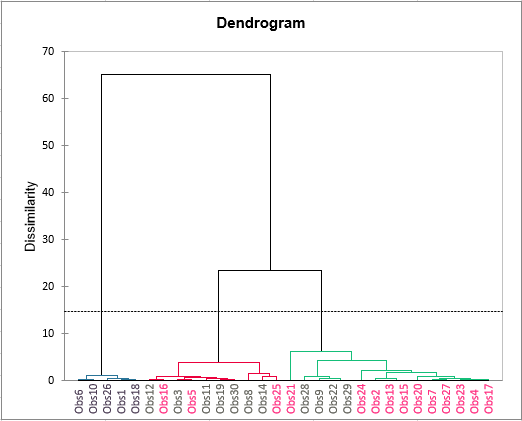
This option is available by selecting your groups in the Color by Group field on the Charts tab.
Create more homogeneous groups thanks to k-means strengthening
The partition obtained by the AHC is not always optimal and can be improved by strengthening it with the K-means algorithm. Some observations can switch classes to make the classes more homogeneous (intra-class inertia is decreased).
This strengthening is available in the Options tab.
Automatically calculate the new number of classes based on new indexes
We have added Hartigan, Silhouette and Calinski Harabasz indexes to our truncation methods so you can choose the ideal number of classes that will get you the best groupings. Please note that these indexes can be used will all distances (not just Euclidean distance) thanks to our R&D team's discoveries.
These indexes are available in the Truncation field in the Options tab.
Visualize whether an observation belongs to the right group thanks to the silhouette coefficients
When observations have silhouette scores close to 1, it means that they have been well grouped. However, if the silhouette score of an observation is negative, then the observation is situated at the very limit between two groups and could have been placed into another group.
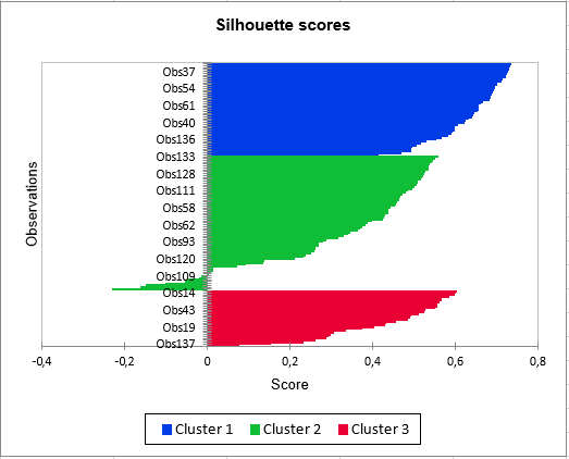
Silhouette scores are available in the Outputs and Charts tabs.
Form groups with negatively linked variables
Directional classification enables you to group variables that are negatively correlated with each other (for example the price and demand of a given good). This type of classification is now possible thanks to the new closeness measure called “Squared correlations”.
Squared correlations are available in the Proximity type field in the General tab.
Count the differences between 2 observations using the Hamming distance
This distance is often used in IT, signal treatment and telecommunications. It enables us to count the number of differences between 2 observations. It represents the opposite of Co-occurrence, which counts the identical number of items between 2 observations.
This distance is available in the Dissimilarities field in the General tab.
Quickly identify misclassified observations
We have added a new Noisy observation option in order to quickly identify observations that have fewer characteristics in common with the other observations. For example, it is often a good idea to suppress extreme values.
An observation is considered noisy when its correlation with the barycenter of its class is less than the threshold entered by the user.
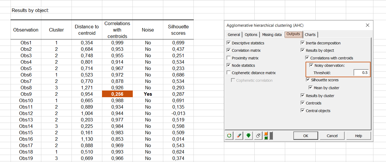
This new option is available in the Outputs tab.
How to benefit from these improvements?
If you’re not using the latest XLSTAT version yet, (2022.1.2) then do not waste another minute! Update your XLSTAT now.
Latest tweets
No tweet to display