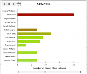
Bar chart race
Use this tool to visualize the evolution of a quantitative variable over time for several groups of observations. Available in Excel using the XLSTAT software.

When to use a Bar Chart Race?
To visualize values of a variable for different groups (categories), we often use bar charts. The height of each bar represents the value of the measured variable for a given group. However, if the variable is measured at different times, the classical bar chart cannot be used to represent the evolution over time. This is where the bar chart race comes in handy. It allows to visualize the evolution of a variable over time on a single dynamic chart.
Options of the Bar Chart Race functionnality in XLSTAT
Fixed position
- Smallest at bottom: The group with the lowest value at the last time will be displayed at the botton of the chart.
- Largest at bottom : The group with the highest value at the last time will be displayed at the bottom of the chart.
- Sort alphabetically : Groups are displayed in alphabetical order.
Colors
- Distinct colors: Each group is displayed with a different color.
- Color scale: A graduated color scale is used so that the group with the highest value at the last time is displayed in dark red.
Data
- Cumulate: At each time interval t the displayed value is the value present in your data at time t plus the value at time t-1.
- Raw data: At each time interval the displayed value corresponds to the value present in your data.
Buttons on bar chart race
Several buttons are displayed within the bar chart race whic allow to:
- Change the value of the time variable and thus display bars at a specific date
- Move backward in time.
- Stop the bar chart race animation.
- Move forward in time.
- Set the speed of the animation ( 1 very slow - 10 very fast).


analyze your data with xlstat
14-day free trial